tuners Cars
Turners Cars Insurance landing Page
Turners Cars is the largest used car network in New Zealand with 18 car-dealer locations nationwide. They've been helping Kiwis buy and sell used cars for over 50 years. And if customers want car finance or car insurance, they can sort that out for them as well.
I was honoured to work with a team of 3 UX designers and a developer to build a simple and useful insurance experience for the Turners Cars customers to involve them to find accurate information regarding insuring the cars which were lost on the existing website.
About the project (Business objective)
Insurance section needs to be:
-
Be more clear on the Turners Cars home page.
-
Sufficient enough to convey accurate data to the insurance clients.
-
Increased the rate of viewers for the business growth.
-
Expanded to be known to be able to compete with the competitors.
-
Be more attractive to absorb more clients to insure their car not only just because of they buying new cars, but also their previous cars and their families cars as well.
-
Be responsive to clients in terms of giving 24/h online service assistant.
The Challenge
The challenge was to redesign the insurance section of the Turners Cars website, focusing on the priority of users' needs. This involved providing information about insurance and 24/7 assistance to address their general questions, and presenting relevant data to emphasize the importance of insurance. These efforts aimed to increase the number of insurance clients."
Why is this a Problem
-
The majority of clients are not aware that Turners Cars also provide the insurance service.
-
Almost none of the clients knows that they can buy insurance without buying cars.
-
There is only one qualified insurance staff to provide the service for the client on-site and explain about the insurance multi-policies, payments, renewing the policies, getting the quote which frustrated the customers, due to the fact that there is no automotive system available for them to fill the forms online and no enough data available upfront on the website.
-
After waiting for so long, clients prefer to buy the insurance from the competitors.
-
There is no option online available to get a quote and renew the policies for clients.
Design Approach
DISCOVERY
User research
Implementation
Usability testing
& iteration
DEfine
Task analysis
Design
Prototype
Insurance Staff
Empathy Map
Persona
User Story


Former Client
Empathy Map
Persona
User Story


Card Sorting & User Flow


We combined sections from user flow V.01 to make it quicker. We added the option to add another policy. Steps were merged for efficiency. By simplifying the flow, users can achieve their goals faster.
Dot voting system, low fidelity wireframe


Our UX team conducted a dot voting system to select the best and simplest wireframe design. The choice was based on users' pain points, prioritizing price options (Annually, monthly, weekly), and displaying various policies.
Mid Fidelity Wireframe

User Testing R1,Test Analysis & Severity Rating 'NN groups'


After conducting thorough research and identifying users' pain points, we developed a comprehensive testing plan. To assess the severity of the identified issues, we utilized Jakob Nielsen's heuristic evaluation, a well-known usability evaluation method, to test with users.
Design Iteration, User Testing R2 & Testing Analysis


-
Relocating the price from the top to the bottom based on user preference to view it after the description, making it more intuitive.
-
Enhancing the clarity of a specific section by using bold visuals and obvious pictures/icons to improve user recognition.
-
Improving the identification of policies as downloadable PDF documents by separating the icons from the text for better user understanding. Also, separating the comparison section for improved readability.
-
Adding a "renew" button on the insurance landing page for easy access, addressing the difficulty users faced in finding the "insurance Renew button" after login.
-
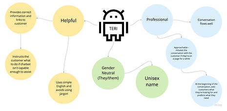
Modifying the chatbot section based on user recommendations by using an icon with accompanying text for better visibility and comprehension.
Design System & Chatbot Solution


-
We chose our design system based on the existing Turners Cars website to ensure consistency across all pages.
